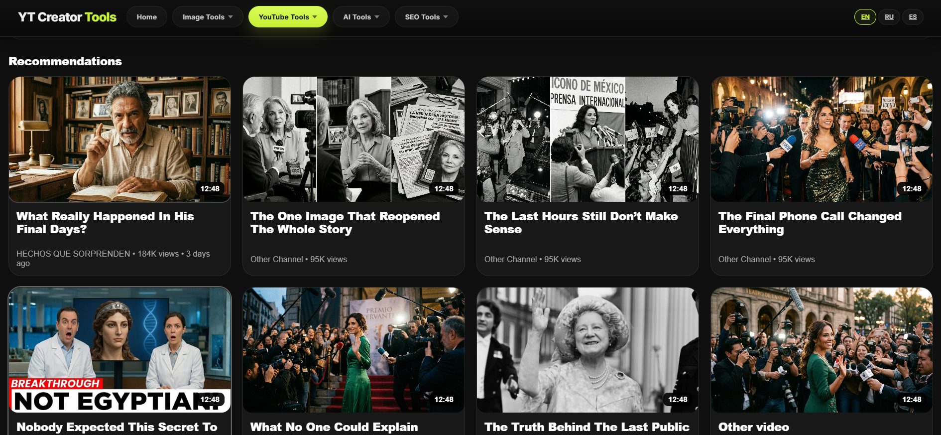
A YouTube thumbnail is not decoration. It is not a polite little accessory sitting next to the real work. It is part of the packaging, part of the positioning, and very often part of the reason someone clicks or keeps scrolling without a second thought. That is exactly why A/B testing YouTube thumbnails matters. If the cover influences performance, then guessing the cover is not a strategy. It is just optimism wearing a blazer.
Many creators spend serious time on scripts, hooks, pacing, editing, sound, and storytelling. Then they choose the thumbnail based on instinct, personal preference, or whichever version looked better after staring at it for too long. That sounds normal until you remember one uncomfortable detail: the audience does not see the thumbnail with your context. They see it for a split second, among dozens of other options, while making a very fast decision. What you think looks strong and what actually earns attention are not always the same thing.
What A/B testing really does
A/B testing thumbnails means comparing two or more thumbnail options to see which one communicates better in a real browsing environment. The point is not simply to ask which design feels prettier. The point is to find out which thumbnail creates a stronger first impression, clearer visual message, and better click potential under actual viewing conditions.
This matters because thumbnails do not compete in isolation. They compete in feeds, search results, suggested video panels, and channel pages. A cover that looks fine on a big editing canvas can become weak, crowded, or forgettable when reduced to the size viewers actually see. That is where comparison becomes useful. It reveals which option survives contact with reality.
Why creators misjudge their own thumbnails
Creators are usually too close to their own work. They know the topic, understand the story, recognize the visual reference, and remember why every tiny detail was placed exactly where it is. The viewer knows none of that. The viewer is scrolling quickly, half distracted, and not especially interested in appreciating your internal design logic.
This is one of the biggest reasons thumbnail testing is valuable. It helps remove ego from the process. Instead of asking, “Which version do I personally like more?” you start asking, “Which version is easier to understand, faster to read, and more likely to earn the click?” Those are much better questions. Also slightly less flattering, which is probably why people avoid them.
Why small thumbnail changes can make a big difference
The difference between a weak thumbnail and a strong one is not always dramatic. Sometimes it is a tighter face crop, cleaner contrast, fewer words, better subject separation, stronger emotion, or a simpler background. Sometimes the best change is not adding more. It is removing what did not need to be there in the first place.
That is exactly why thumbnail comparison is useful. It helps you see performance differences that are easy to dismiss during design. One version may feel more balanced. Another may communicate faster. One may look more polished. Another may look more clickable. On YouTube, “more clickable” tends to have a suspicious habit of mattering quite a lot.
Testing protects good videos from weak packaging
A strong video can underperform if the packaging is weak. That is frustrating, but it is also common. The content may be good. The topic may be strong. The title may be decent. But if the cover does not create immediate visual clarity, the video may never receive the first click it needs to prove itself.
This is why testing thumbnails is not vanity. It is risk reduction. You are giving the video a better chance to enter the conversation with a stronger first impression instead of trusting one design version blindly and hoping the internet will be in a generous mood that day.
Why comparison is better than assumption
Assumption feels efficient. Testing is what tells you whether the assumption deserves respect. That is an important distinction. Many thumbnail decisions are based on statements like “this one feels stronger” or “I think this version looks more emotional.” Sometimes that instinct is right. Sometimes it is gloriously wrong.
Comparison helps move from taste to evidence. Even if you do not have access to platform-native experiments for every situation, using a thumbnail comparison tool can help you review different directions more objectively before publishing. It is a practical step for creators who want to compare YouTube thumbnails instead of treating packaging like a guessing game with brighter colors.
Thumbnail A/B testing improves decision speed
Another overlooked benefit of testing is speed. Not because testing itself is faster than guessing, but because it reduces endless second-guessing later. Once you compare a few strong options properly, weak choices become easier to eliminate. The process becomes clearer. Decisions feel more grounded. You waste less time defending a version just because you already spent an hour nudging shadows around it.
In real workflows, that matters. Creators often publish under time pressure. They need to move from idea to package without turning every thumbnail into a philosophical crisis. A comparison workflow helps keep quality high without making every decision feel theatrical.
What thumbnail testing usually improves
- Clarity: the viewer understands the main subject faster.
- Focus: the important visual element becomes easier to notice.
- Contrast: the design competes better in a crowded feed.
- Readability: text and shapes hold up better at small size.
- Click potential: the thumbnail feels more immediate and more intentional.
Why this matters for marketing, not just design
A thumbnail is a marketing asset. It influences perception before the viewer has consumed a single second of the actual video. In that sense, A/B testing thumbnails is not only a design improvement step. It is part of message optimization. You are testing which visual promise attracts the right audience more effectively.
That makes thumbnail testing relevant not only for YouTubers, but also for marketers, editors, agencies, channel managers, and content teams. If the thumbnail affects discovery, click behavior, and viewer expectation, then it belongs in the performance conversation, not just the visual one.
Why this topic matters for SEO and creator intent
The search intent behind this topic is strong because people looking for thumbnail A/B testing usually want a direct answer or a direct tool. They already understand that the thumbnail matters. They are looking for a better way to compare options, improve click appeal, and make stronger decisions before publishing.
That makes this a valuable support topic for a real YouTube thumbnail comparison tool. The article answers the “why,” while the tool handles the “now show me.” That is generally a healthier arrangement than making people read a long page and then leaving them alone with their unresolved thumbnail indecision.
Final thoughts
A/B testing YouTube thumbnails matters because thumbnails matter. It is that simple. The cover shapes the first impression, influences the click, and helps determine whether a strong video gets the attention it deserves or quietly disappears under better packaging.
Testing does not guarantee a viral hit. Nothing respectable does. But it does help you make smarter choices, reduce creative blind spots, and stop treating one of the most important visual assets in your publishing workflow like an afterthought. Which, to be fair, it never was.