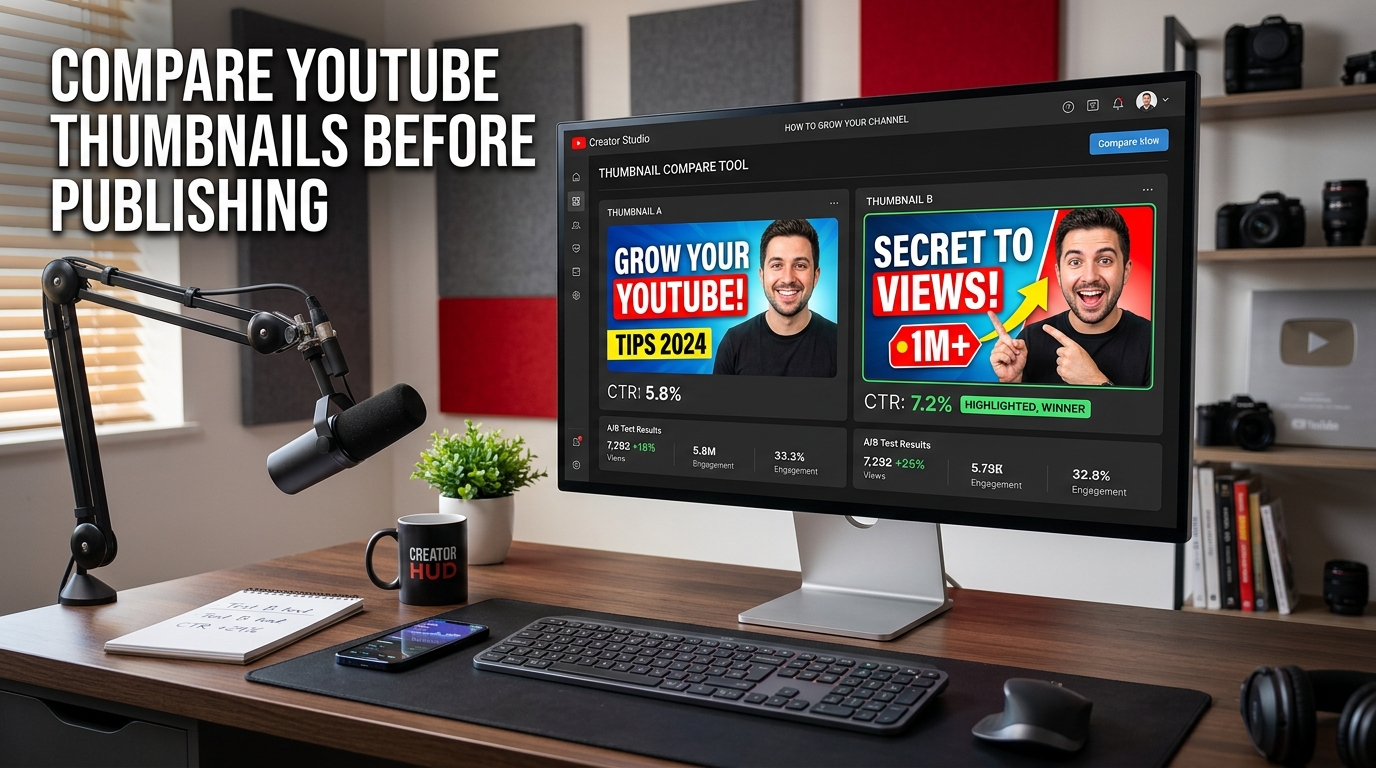
Most creators do not publish one thumbnail. They publish one final thumbnail after rejecting, doubting, tweaking, defending, rethinking, and emotionally overinvesting in several others. That is normal. What is less helpful is making the final choice with no real comparison process. If the thumbnail affects clicks, then choosing between thumbnail options should not depend entirely on mood, fatigue, or whichever version you happened to stare at longest. That is why it helps to compare YouTube thumbnails before publishing.
Thumbnail comparison is not about turning every upload into a lab experiment with dramatic music in the background. It is about making a better decision before the video goes live. A stronger thumbnail can improve clarity, focus attention faster, and make the packaging of the video feel more intentional. A weaker thumbnail can quietly sabotage a perfectly good upload before it ever gets a fair chance.
Why comparison matters before publishing
Once a video is live, changing the thumbnail is still possible, but it is much better to enter the publishing moment with your strongest option already chosen. Comparing thumbnails before publishing helps reduce guesswork. It lets you step back, review alternative directions, and see which version communicates more clearly when treated like a real cover rather than a design file you are emotionally attached to.
This matters because thumbnails do not compete in isolation. They compete in feeds, recommendations, search results, and crowded visual environments. A thumbnail that looked “fine” on a large editing canvas may feel weak, cluttered, or strangely forgettable once it is reduced to actual browsing size. Comparing versions before publishing helps you catch that problem early.
What should you compare in a thumbnail?
The obvious answer is “everything,” but that is not especially useful, and your schedule probably has other opinions. A better approach is to compare the things that affect immediate visual communication: focal point, emotion, contrast, readability, object size, face crop, text load, background simplicity, and how clearly the image supports the title.
In many cases, the strongest thumbnail is not the prettiest one. It is the one the viewer understands fastest. That distinction matters a lot. A clean visual promise usually beats an overdesigned concept that requires interpretation, patience, and a level of goodwill the average scrolling user has not brought with them.
Compare thumbnails at real viewing size
This is where many people go wrong. They compare thumbnails at full size, zoomed in, surrounded by empty screen space, while quietly admiring details no normal viewer will ever notice. That is not how thumbnails are consumed. They are seen small, quickly, and in competition with many other images.
A proper comparison should help you evaluate thumbnails under conditions closer to reality. That is exactly why a dedicated thumbnail comparison tool is useful. It helps you review cover options more objectively and see which one actually survives the feed better instead of just winning the private design beauty contest.
What usually makes one thumbnail win over another
Sometimes the difference is large. One version may have a clearer face, stronger object, better contrast, or a simpler message. Other times the difference is surprisingly small: slightly tighter crop, fewer words, less background noise, better shadow separation, or stronger emotional focus. These details may look minor during editing but become very important when the thumbnail is shrunk down and forced to compete in a crowded layout.
This is one reason comparison matters so much. Small changes often create large performance differences. You may think two thumbnails are basically the same, only to realize one is noticeably easier to process at a glance. On YouTube, that is not a small advantage. That is often the advantage.
How thumbnail comparison improves workflow
Comparing thumbnails before publishing does more than improve the final choice. It also improves the speed and quality of future decisions. Once you get used to evaluating thumbnails side by side, weak habits become easier to spot. You notice when text is too small, faces are too far away, contrast is too soft, or the whole composition depends on context the viewer does not have.
That makes your design process sharper over time. In other words, comparison is not only a selection method. It is feedback. Quiet, useful, occasionally rude feedback. Which is still better than publishing a weak cover and letting the analytics deliver the same message later with less tenderness.
Why creators misjudge their thumbnails
Creators usually know too much. They know the video, the story, the reference, the joke, the angle, and the reason every detail exists. The viewer knows none of that. The viewer only sees a small image and a title while deciding very quickly whether your video deserves a click.
That is why self-evaluation is difficult. You are not looking at the thumbnail like a cold viewer. You are looking at it like someone who remembers the entire creation process. Comparison helps reduce that blind spot by forcing you to judge alternatives against each other instead of giving every familiar design choice an automatic emotional discount.
How comparison connects to title and packaging
A thumbnail should not be judged alone. It should be judged as part of the package. The cover and the title work together. A great visual with a weak title can still underperform. A strong title with a confusing thumbnail can do the same. This is why many creators benefit from comparing covers while also refining supporting packaging elements such as the headline and metadata.
If you are working on the full upload package, related tools like the YouTube title generator, the YouTube description generator, and the YouTube tags tool naturally fit into the same workflow. The goal is not to overcomplicate publishing. The goal is to make the important choices slightly less accidental.
What to avoid when comparing thumbnails
The first mistake is comparing too many variables at once. If every version changes everything, it becomes harder to understand what actually improved. The second mistake is choosing based on personal taste alone. Taste matters, but only up to the point where performance begins to care. The third mistake is falling in love with details that disappear at feed size.
Another common mistake is only comparing versions that are too similar. If the difference is barely visible, the comparison will not teach you much. Strong comparison works best when each option represents a meaningful direction: more direct, more emotional, more minimal, more dramatic, more product-focused, and so on.
Why this topic has strong search intent
People searching how to compare YouTube thumbnails before publishing usually want a direct answer and a practical method. They already understand the thumbnail matters. What they need is a clearer decision process. That makes this topic strong for SEO and useful for product-led content, because the article explains the “why” and “how,” while the actual comparison tool handles the action step.
That is a very healthy combination. Useful education creates trust. Practical tooling creates momentum. And the user gets to solve the problem before publishing instead of discovering it later through weaker click performance and a slowly growing sense of avoidable regret.
Final thoughts
If you want better YouTube packaging, compare your thumbnails before publishing. It is one of the simplest ways to improve decision quality without turning your workflow into a grand production. The best thumbnail is not always the one you liked first. It is the one that communicates best under real conditions.
That is the whole point. Publishing is already full of enough uncertainty. There is no need to add unnecessary thumbnail guesswork to the list when a clearer comparison process can do the job with far less drama.